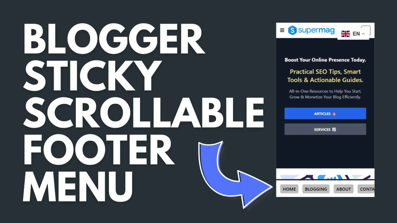
How to Add a Sticky Footer Navigation Menu to Your Blogger Site
If you’ve ever used YouTube or Instagram on your phone, you’ve probably noticed the navigation bar fixed to the bottom of the screen. That little detail makes a huge difference — no scrolling back to the top, no hunting for links. It just works.
You can add the same thing to your Blogger site in just a few minutes, and your readers will thank you for it.
What It Does
The sticky footer menu stays pinned to the bottom of the screen at all times. On mobile, it scrolls horizontally so you can fit as many links as you need without cluttering the layout. On desktop, the links center themselves for a cleaner look. It’s a small touch that keeps visitors moving through your site instead of bouncing away.
The Code
Paste the following into your Blogger theme wherever you’d like the menu to appear — typically just before the closing </body> tag.
<!-- Sticky Footer Menu -->
<div class='Footer_Link_List' id='Footer_Links'>
  <ul>
    <li><a href='/'>Home</a></li>
    <li><a href='/about/'>About</a></li>
    <li><a href='/contact/'>Contact</a></li>
    <li><a href='#'>Privacy</a></li>
    <li><a href='#'>Terms</a></li>
    <li><a href='#'>Blog</a></li>
    <li><a href='#'>Services</a></li>
    <li><a href='#'>Portfolio</a></li>
    <li><a href='#'>Testimonials</a></li>
    <li><a href='#'>FAQ</a></li>
  </ul>
</div>

<style>
.Footer_Link_List {
  position: fixed;
  width: 100%;
  padding: 15px;
  bottom: 0;
  left: 0;
  right: 0;
  background: #fff;
  border-top: 1px solid #ddd;
  z-index: 9999;
  overflow-x: auto;
  -webkit-overflow-scrolling: touch;
  cursor: grab;
}

.Footer_Link_List::-webkit-scrollbar { display: none; }
.Footer_Link_List {
  -ms-overflow-style: none;
  scrollbar-width: thin;
}

.Footer_Link_List ul {
  display: flex;
  justify-content: flex-start;
  list-style: none;
  margin: 0;
  gap: 15px;
  white-space: nowrap;
}

@media (min-width: 768px) {
  .Footer_Link_List ul {
    justify-content: center;
  }
}

.Footer_Link_List li { flex: 0 0 auto; }

.Footer_Link_List a {
  text-decoration: none;
  color: black;
  font-family: system-ui;
  text-transform: uppercase;
  font-weight: 500;
  font-size: 17px;
  padding: 10px;
  border-radius: 6px;
  background: #ededed;
  display: inline-block;
  transition: transform 0.3s, background 0.3s;
}

.Footer_Link_List a:hover {
  background: #f0f0f0;
  transform: scale(1.1);
}
</style>

<script>
const slider = document.getElementById('Footer_Links');
let isDown = false, startX, scrollLeft;

slider.addEventListener('mousedown', (e) => {
  isDown = true;
  startX = e.pageX - slider.offsetLeft;
  scrollLeft = slider.scrollLeft;
});

slider.addEventListener('mouseleave', () => { isDown = false; });
slider.addEventListener('mouseup', () => { isDown = false; });

slider.addEventListener('mousemove', (e) => {
  if (!isDown) return;
  e.preventDefault();
  const x = e.pageX - slider.offsetLeft;
  slider.scrollLeft = scrollLeft - (x - startX) * 2;
});
</script>
Customizing It
Once it’s in place, making it your own is straightforward. Update the href values and link text to match your actual pages. To change the button color, swap out #ededed in the CSS. Want it to show only on mobile? Wrap the whole thing in a Blogger conditional tag to hide it on desktop.
That’s really all there is to it. Small UX improvements like this add up — and a reader who can navigate easily is a reader who sticks around.